My Contributions to the Newt Project
In this blog post, I explain my contributions to the Newt project over around 3 weeks.
Introduction
So, I have been working on the Newt project (which is a project about what is usually called “systems biology”, especially visualizing biological pathways) for about three weeks (not counting Eid). I will go through my contributions in chronological order below.
Added at the time of the edit, 20th of August Part 2 is out. You can view it here. If you are viewing this as part of GSOC final submission, you should know that part 2 also covers my work during the program. Nothing else in this blog, except those two blog posts, is part of my submission. I provide the links to specific GitHub issues in both blog posts, from which you can view the code. The issues are going to be incorporated into the upcoming Newt 4.0 release.
Creating an SBML Legend
GitHub Issue A “legend” is defined as the wording on a map or diagram explaining the symbols used for those of you who are not familiar with that sense of the word. SBML stands for Systems Biology Markup Language which is linked with something called CellDesigner. None of these are terribly important for you to know fully. Here is a quick explanation:
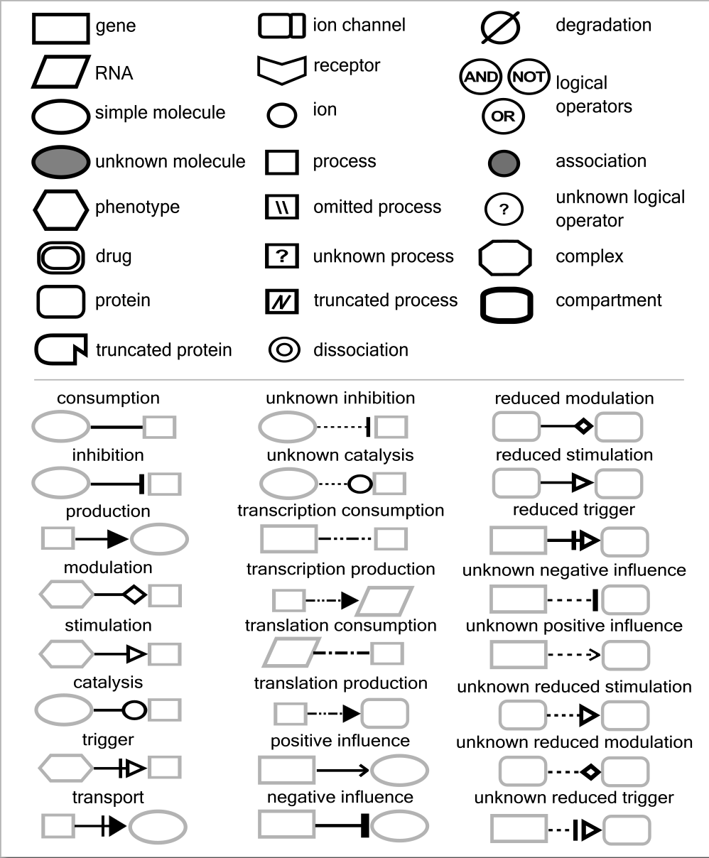
SBML is a way to define and show biochemical reactions with certain signs such that there is very little confusion about the meaning of the symbols. A legend is a document (briefly) explaining these symbols and their meanings. Here is the official CellDesigner legend:
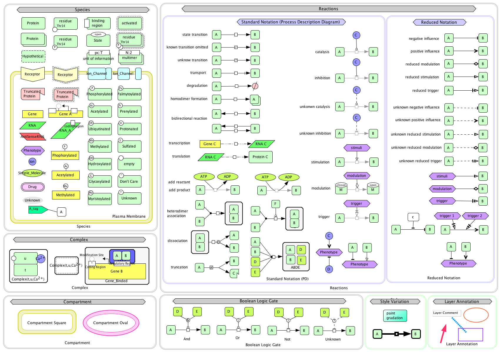 .
.
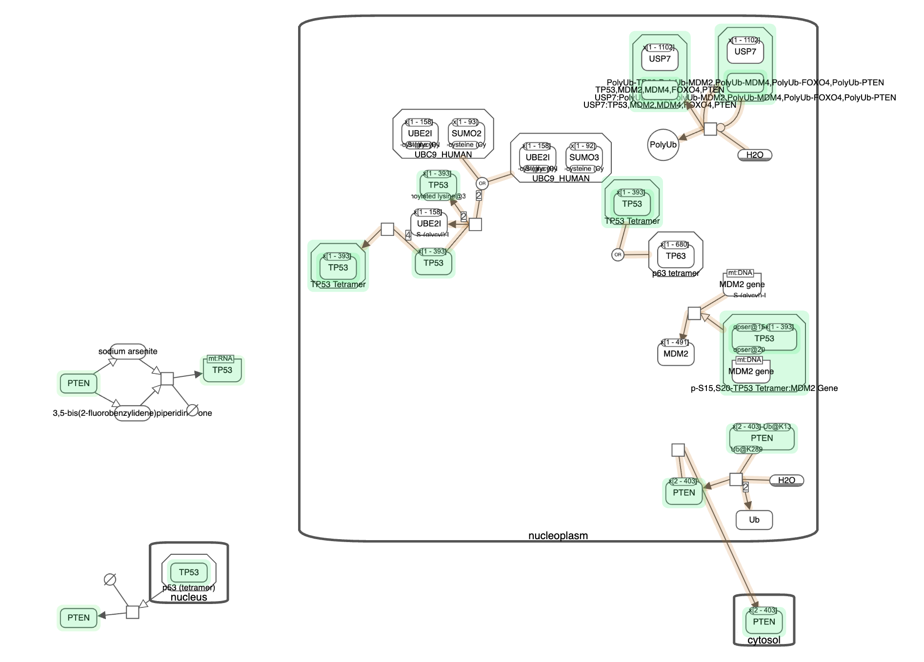
I was tasked with making a similar legend and integrating it to the application. I came up with this:
This was then integrated into the application. It now looks like this:
Overall, I would say that this was a relatively simple although somewhat time consuming task since I had to create this image using inkscape, which was not something I was familiar with.
Query Highlighting
GitHub Issue There exists a database called PathwayCommons which contains a lot of biological pathways and interactions (mainly between genes). These database services have what’s called an API (stands for Application Programming Interface). What an API allows us to do is asking these services some data (in this case, it is giving us information about pathways). In Newt, there is an interface which allows us to make API requests (that is, asking a web service for some information) and display the result in a user friendly way. Here is a demonstratiton (warning: most of this video is the load screen, feel free to move to the 20s-25s mark):
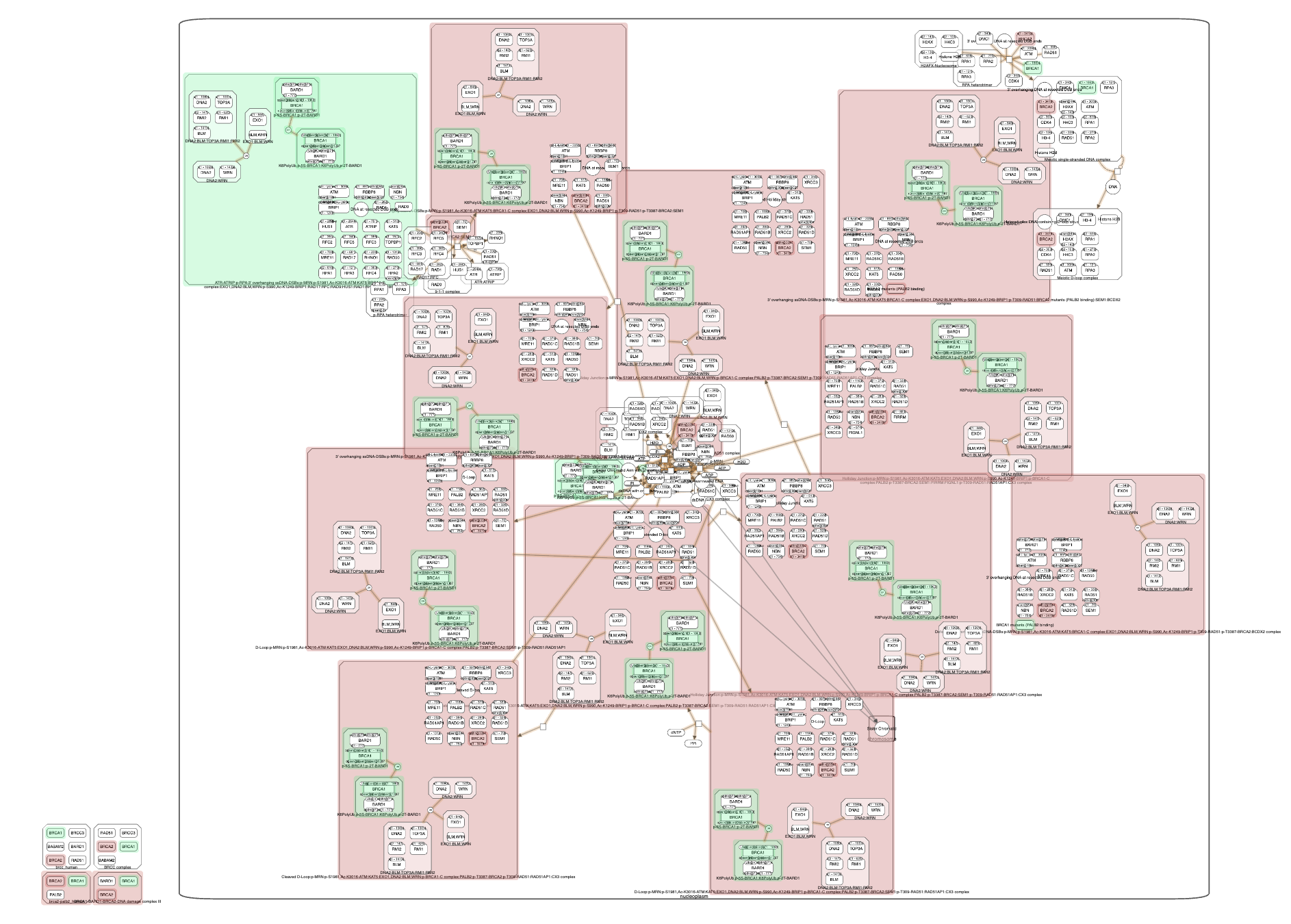
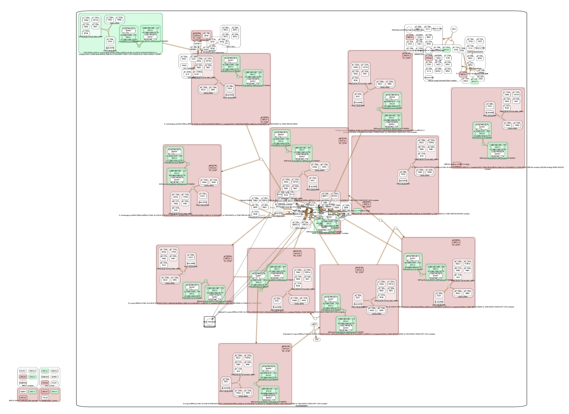
I was tasked with color coding this output so that it is more clear what is going on. I will skip over the details of how I did it (and causing a temporary crash on the internal server…) and just show you the result. Below is what comes out after the same query in the video:
There are also more colorful queries, especially ones with both source and target nodes (understanding these terms are not relevant). Here is another picture (this one is a more complicated query between BRCA1 and BRCA2):
Underlay Highlighting
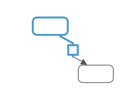
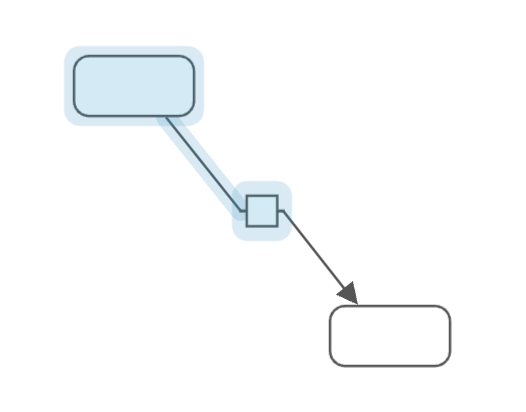
GitHub Issue Well, in order to show the previous one, I had to show you this one as well, so, brief let me be. Newt originally had a highlight feature. It looked like this:
After my implementations, it looks like this:
This is a better highlighter for a couple of reasons:
- It is visually more appealing and apparent.
- It doesn’t interfere with situations where the color of the edges have significance.
Map Type Display on Tabs
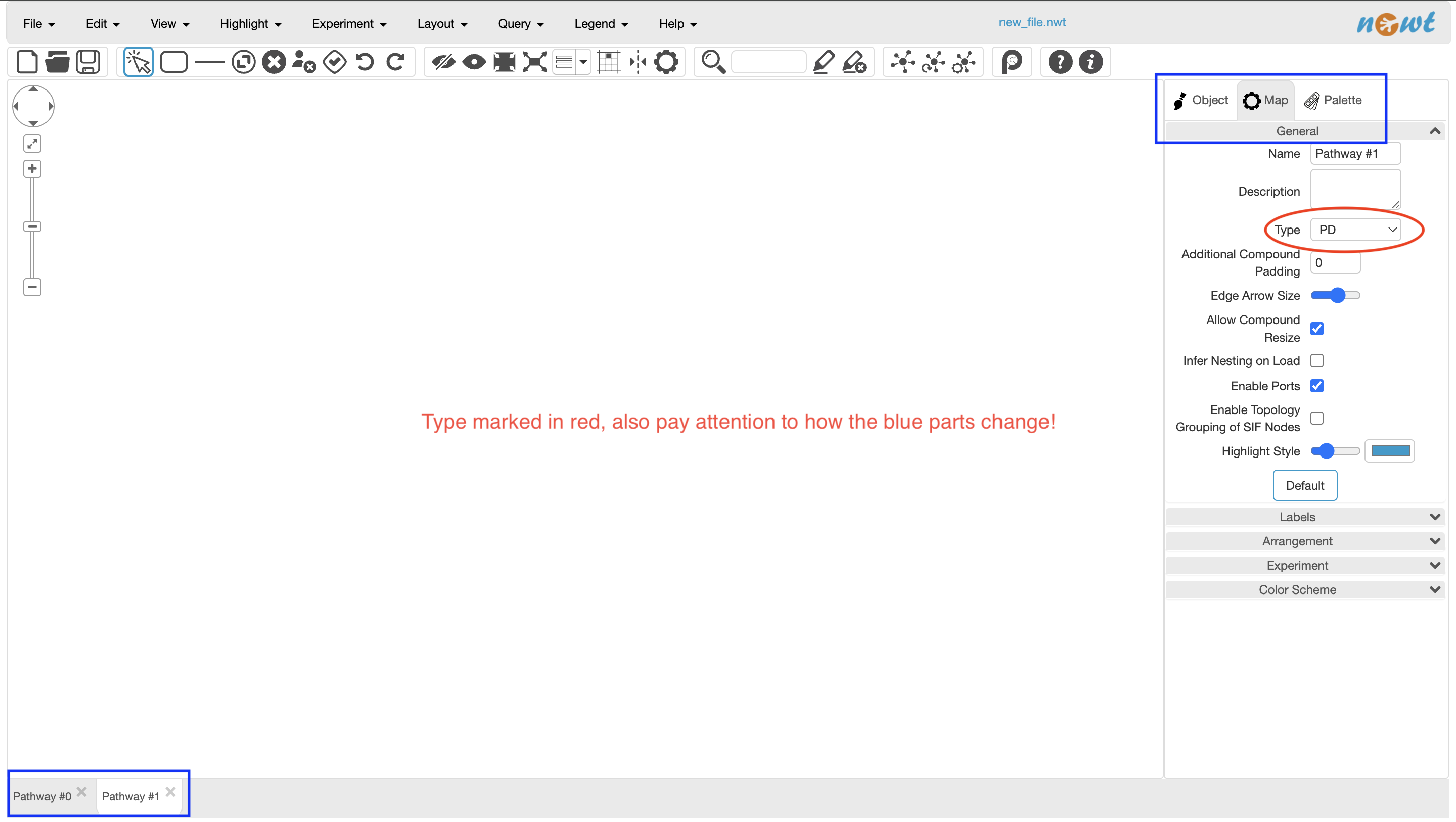
GitHub Issue We already talked about how we represent maps with symbols and legends. However, people have come up with different sets of symbols and legends over the years. Newt currently implements PD (process description), AF (activity flow), SIF (simple interaction format), SBML (systems biology markup language) and a combination of these. Every image that I can generate has uses at least one (possibly a combination of) the symbols of these dialects. This is called the “type” of the map. Previously, we could see the type of the map from the sidebar:
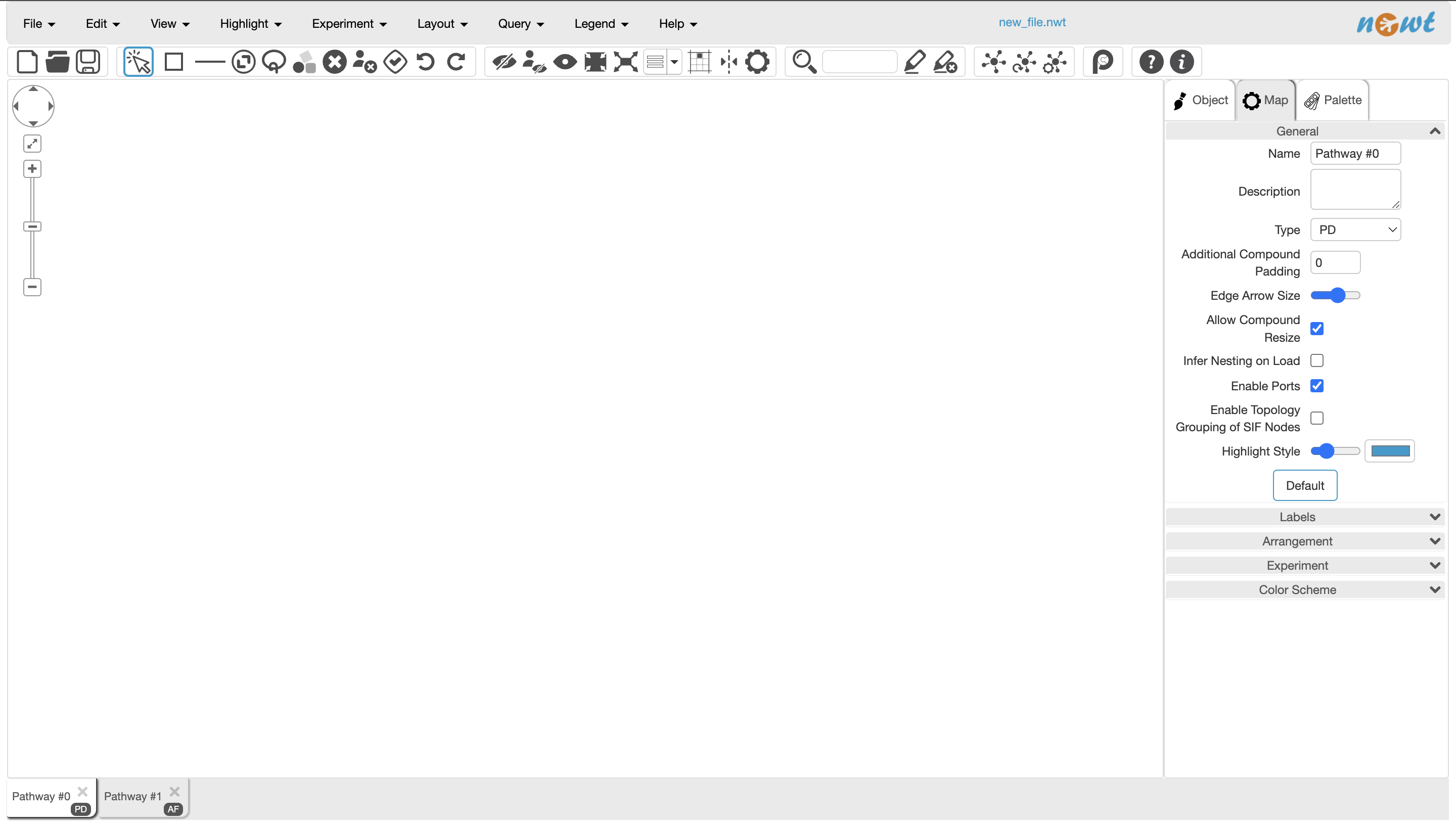
After my visual changes, this is now how it looks (pay extra attention to the blue parts in the previous picture):
As you can see, there is some visual change in the blue marked parts (marked in the previous picture). First of all, the map type is now shown on the tabs on the bottom right. Also, there is now a shadow effect on the tabs (in both blue marked places). This is technically called a box-shadow, which enhances the visuals.
About Some Small Bugs
GitHub Issue A bug is defined as an error in a computer program or system. During my time working on the Newt project, I also found some issues with the works of other people working there. I don’t want to go into details, suffice it to say that there was some weird behavior with a pop-up panel. I pointed this out and also helped in implementing the ideal behavior for smoother user experience.
GitHub Issue There was a small issue related to map loading that I fixed as well.
Query Result Simplification
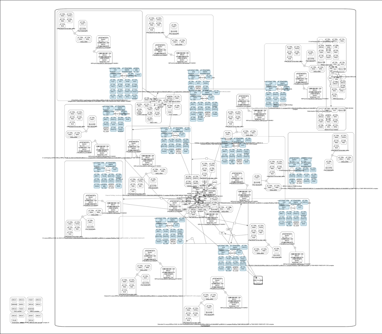
GitHub Issue Remember this picture?
Well, there is a problem. It’s big. It’s huge. It contains a lot of excess information. So, there was an idea on simplifying some of these extra bits of pieces. We do that by removing the nodes that we see as excess. We developed an algorithm (defined as a process or set of rules to be followed in calculations) on how to select what goes and what remains. The algorithm is a bit complicated to explain in this post, but ultimately not very complicated at all. What you should know is that the way we decide is not random. The things that go have to satisfy a certain level of simplicity (meaning that nothing complicated is lost). Without further yapping, let me present you with the simplified version of the same query:
still complicated, but noticably simpler. Here is an extra picture on the nodes that we decide to delete with this algorithm (anything that is highlighted in blue means that it is going away):
Closing Remarks
Hope this was a fun and easy read! I tried to make this piece as accessible as I can for the general public, which is not how I wrote the first two more technical posts. Anyhow, these document my changes (as of the date of publication) which is contained in the GitHub record in 7-8 issues and 2-3 pull requests. I think this was a productive couple of weeks for me, and my mentor seems to like my work as well. Currently I am reading about computer algebra, which is a computational/mathematical theory about making a computer solve mathematical problems (such as integration, think WolframAlpha if you are familiar with that). It’s a struggle… But maybe in the future (very future) a blog post about that may come out. Also, I included a Hamlet quotation in this post. Can you figure that out?
